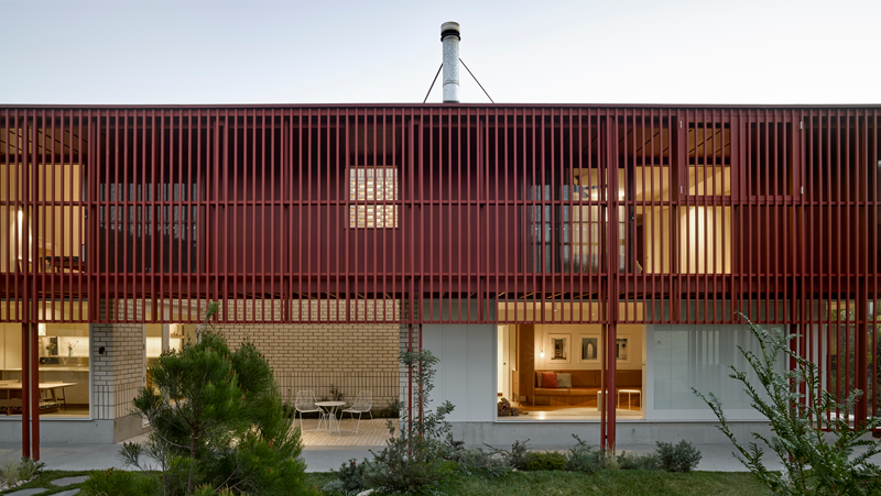
Colour Awards 2020
Each year, architect and design professionals submit entries that demonstrate their exceptional use of colour across a range of projects. After a record number of entries in 2020, our judges have selected projects that captured their attention and named them the 34th Dulux Colour Awards winners.
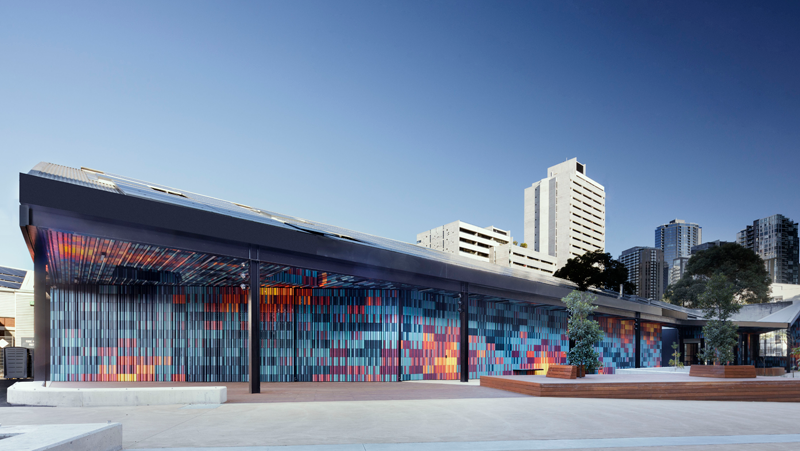
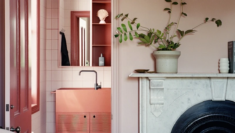
Meet our finalists for 2020. Here are the projects that have best displayed an innovative use of colour across residential, commercial and public spaces.