Dulux Colour Forecast 2006
Experimentation with colour: A fashion influence
Indulgent texturing, patterns, layering and shimmering metallics were at the core of the 2006 theme. The overall look was bohemian inspired where there was no right or wrong in terms of mixing colours, patterns and textures, which created an eclectic feel to homes.
There had been a resurgence in the arts and craft movement, and as a result, patterning and texture was fashionable. This look was married with warmer, cleaner colours across the palettes creating a softer, fresher feel.
Parisienne Mist
The richness of Paris stimulated the senses with sophisticated plums, violets, pinks and blushes. An overall feminine palette, pinks were becoming more in vogue in both fashion and home decoration. The major change was how we combined pinks with other colours. It was common to mix pinks and browns, which encouraged the use of pink for all seasons, not just for spring/summer.
Amalfi Breeze
The beauty of the Italian coast, blue and turquoise hues evoked our love affair with water. Some interesting blue and aqua tones were included in this calming and relaxed palette. There were a variety of blues, ranging from deep-sea blues, moving into more green-based blues, such as aqua and teals and also incorporating some icy blues and classical grey blues. Blues were so very popular in all aspects of home decoration, both in Europe and Australia. We were using blues in eclectic combinations blending cleaner blues, such as aqua, with muddier hues, eg. mustards and browns. Blues were wonderful to use in the home because they provide the feeling of space, serenity and peace.
Venetian Reflections
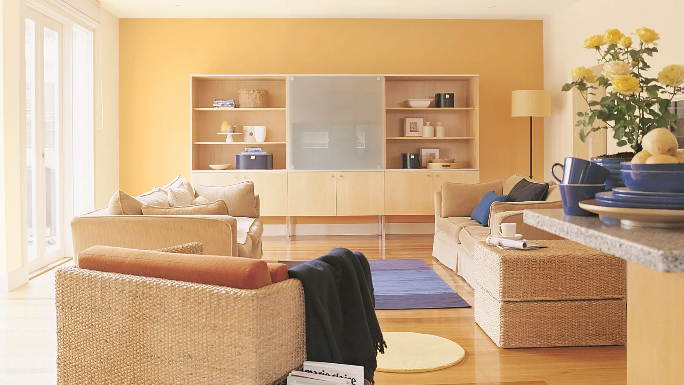
Light travels through Venetian glass reflecting beautiful tones of gold, amber and olives. These gold-inspired greens and olive tones were very popular in European fabric designs. We were also seeing a hint of yellow coming through in fashion and home accessories, which was brightening up this palette. To lift the senses, we urged warm yellow-greens that schemed very well with many other colours such as browns, clarets and brown-reds. The gold tones, with a hint of mustard, were very simple to use in home decoration. Textures were included in this palette to create more colour dimension.
Manhattan Mode
The feel of Art Deco, moves of Manhattan and neutrals mirrored the modern world of 2006. Neutrals and whites created a classic elegance and simplicity in home decoration from total colour scheme to combined with contrasting, deeper colours. The colours brought a sense of contemporary spirit and help created a feeling of a serene and uncluttered space. Textures were very important in this palette as the interest in the texture or shimmer could add a bit of zest to the neutral, especially with the darker hues.
Shanghai Sunset
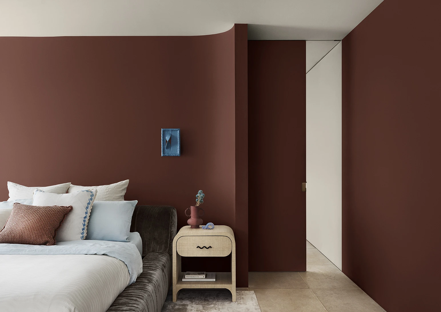
Considered lucky in Asia, bold and daring, red evokes passion and confidence. A beautiful welcoming and majestic palette, created from colours inspired by nature. Sophisticated reds, deep and earthy, bring invitation to any space. The reds included brown-inspired reds, oriental reds, caramels and stones. These were colours expected to provide a true sense of individuality and strength
Moorish Antiquity palette
Enter a historical world filled with ancient, eclectic patterns and textures…browns, beiges, rusts and tans. A cultural kaleidoscope stimulating the senses with an eclectic fusion of pattern, colour and texture, blended with contemporary hues. This gorgeous palette displayed the warmer neutrals with a touch of colour from the orange family. Metallic finishes were incorporated in this palette, as warm neutrals were growing in popularity in Europe, especially in home textiles. Hues such as browns, beiges, rusts and tans all blended beautifully with deep reds, purple-browns and mustard greens.
Dulux Colour Forecast: now and then
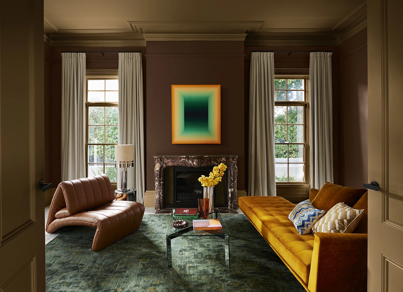
Dulux Colour Forecast 2024 reflects an inner desire for positivity and spaces that nurture within our homes with warm colours such as rich golds, olive greens and reddy browns.
We're proud to be at the forefront of colour trends in interior design as we celebrate the 25th anniversary of the Dulux Colour Forecast!
Download the Dulux Colour Forecast 2024 brochure to explore the three beautiful palettes and be inspired to transform your home with the latest trends.
Love your colour
Dulux Authentic Colour®
Only Dulux colour mixed with Dulux Wash&Wear® paint gives you exact colour accuracy to create Dulux Authentic Colour® palettes that look fresh in your home for years.
Disclaimer
Colours displayed should be used as a guide for your colour selection. To ensure best accuracy, test your colour choice at home by ordering Dulux sample pots, stickers and A4 colour swatches.
