Dulux Colour Forecast 2012
Natural reflections
Fast-moving global, digital and fashion trends inspired Dulux Colour Forecast 2012. Colour blocking, often three or four bold shades at a time, was a key driver of how colour was used. Depth-laden blues, paprika and tonal shades reflecting natural, raw materials were the hottest colours of 2012.
Immerse
The Immerse palette represented freedom of expression. Its deep, chromatic colours from the same colour family enhanced a submerged effect.
Immerse palatte
Intense and immersive colours such as Blue Regent and Wing Commander paired with rich, layered textures reflected how blue fashion trends were evolving into interiors.
Time-honoured
The Time-honoured palette reflected a newfound appreciation for taking the finest elements from the past and weaving them into something new.
Time-honoured palette
The Time-honoured palette was a shift from quantity to quality – from mass production to a new appreciation of bespoke creations, antiques and secondhand goods. Heirlooms, genealogy and honouring our past enjoyed a revival thanks to shows such as, “Who Do You Think You Are?” Give old items a modern twist with colours such as Red Terra and Orangeade.
Re-set
The Re-set palette was about the sharp shift we were undergoing when it came to connection. According to trend forecasters, we were all going to reach a tipping point with ‘virtual fatigue’ and craved real, valid connections.
Re-set palette
The Lifestyle News Network, a global report on trending at the micro and macro level, noted that people were realising the most exciting thing they could do was not online, updating their social network page, but offline and experiencing live events. Re-set your world with colours such as Wayward Grey, Moon Marvel Metallic and Neutral Intrigue Metallic.
Raw
In an era characterised by choice, simplicity was the new luxury. Unmanufactured beauty was one we started to value so much more.
Raw palette
The Raw palette was symbolised by natural colours such as untreated woods and rusted earthy tones that brought the natural landscape inside, seamlessly blending with the environment. Raw celebrated both imperfection and handcraft artisans – it’s the world of Etsy, mass-produced. The Raw palette reflected items in their most untouched state; earthy, neutral and very calming to the harried soul. Think of pure wools, silks and organic cottons, untreated woods, native grasses and food in its most purest form. Return to nature with organic colours such as Teahouse and Limed White.
Carnivale
This Lady Gaga-inspired palette called for vivid colours and bold statements to create impactful and dramatic effects during rough times.
Carnivale palette
Carnivale had no colour clash rules and urged using intense, bright colours and being adventurous about what colours were used together. Celebrate and push the boundaries with bright, bold and flashy colours such as Scarlet Ribbons, Ripe Rhubarb and Lickedy Lick.
Nurture
Welcome to a sensually-starved culture where one of our greatest fears is lack of control. As we accelerate with digital information, we’re simultaneously starving ourselves of basic human sensory stimulation.
Nurture palette
Humans are tactile beings and crave the magic of touch, sight, sound, scent and taste. Uprisings in Libya, Egypt, and Greece, paired with nature’s fury in a record number of fires, floods, earthquakes and cyclones, made us question what was really important to us. It’s this shift to re-engage the senses and ground ourselves and take back some control in our lives, which symbolised the nurture palette. Revisit simplicity and create your sanctuary with colours such as Olive Reserve, Wiggle and Gooseberry Fool.
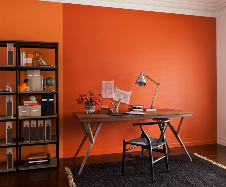
Dulux Colour Forecast: now and then
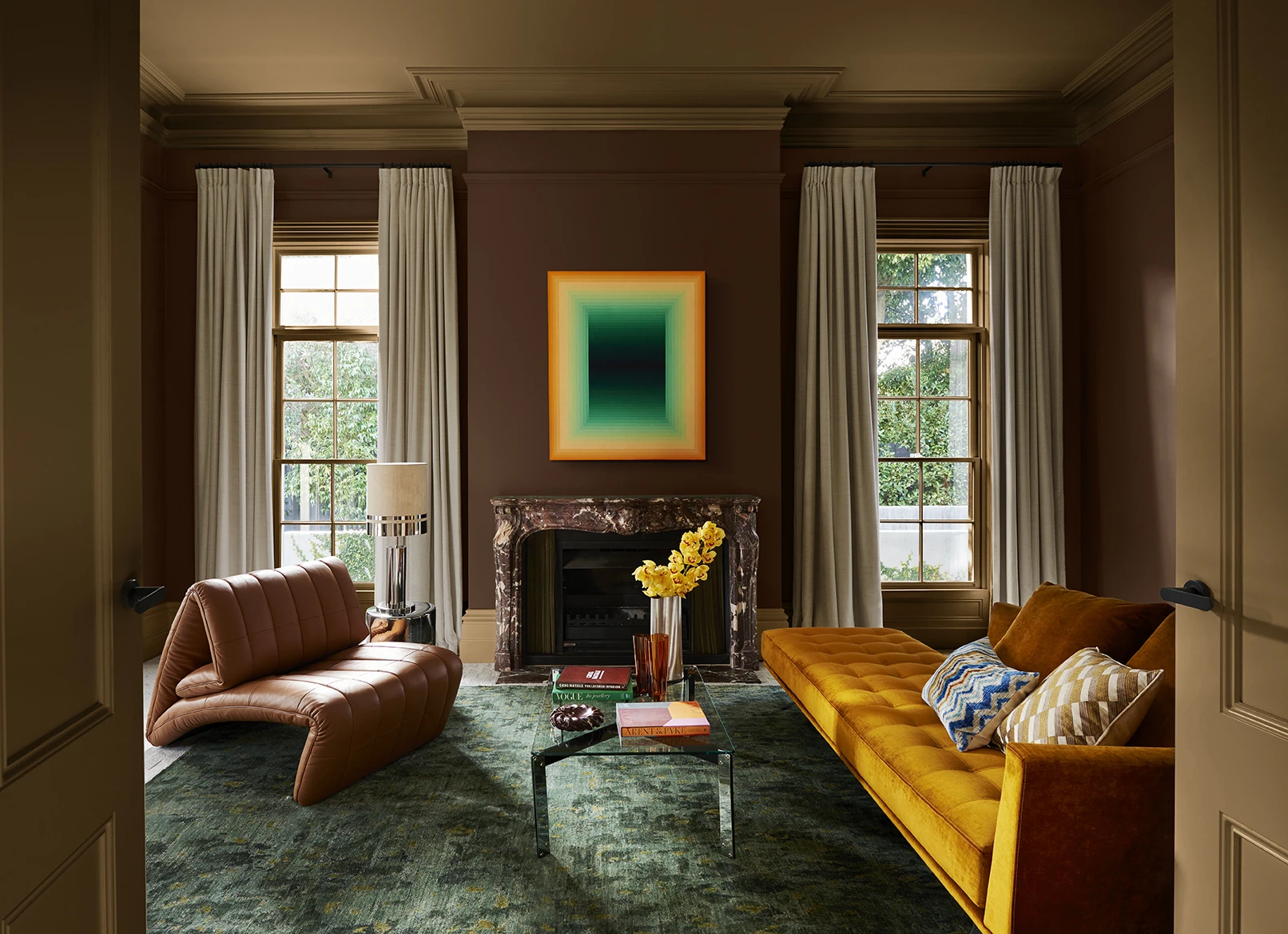
Dulux Colour Forecast 2024 reflects an inner desire for positivity and spaces that nurture within our homes with warm colours such as rich golds, olive greens and reddy browns.
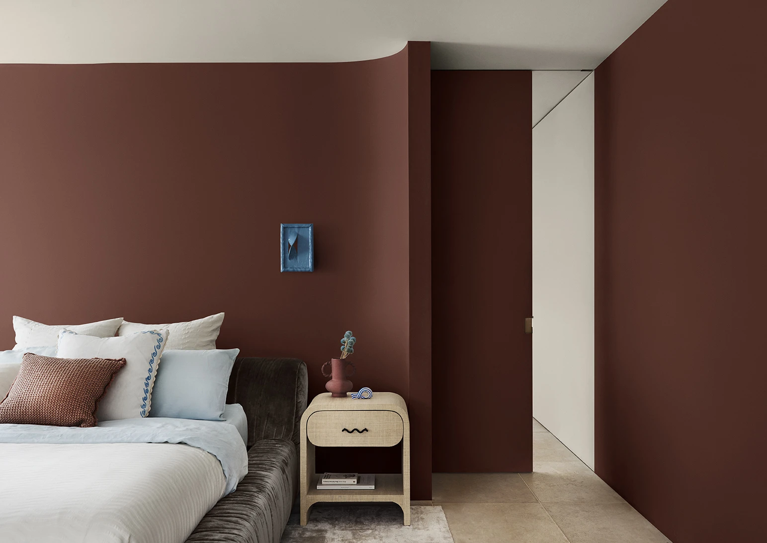
We're proud to be at the forefront of colour trends in interior design as we celebrate the 25th anniversary of the Dulux Colour Forecast!

Download the Dulux Colour Forecast 2024 brochure to explore the three beautiful palettes and be inspired to transform your home with the latest trends.
Love your colour
Dulux Authentic Colour®
Only Dulux colour mixed with Dulux Wash&Wear® paint gives you exact colour accuracy to create Dulux Authentic Colour® palettes that look fresh in your home for years.


Disclaimer
Colours displayed should be used as a guide for your colour selection. To ensure best accuracy, test your colour choice at home by ordering Dulux sample pots, stickers and A4 colour swatches.