2023 Seasonal Trends
Explore the colours of autumn with Kerrie-Ann Jones
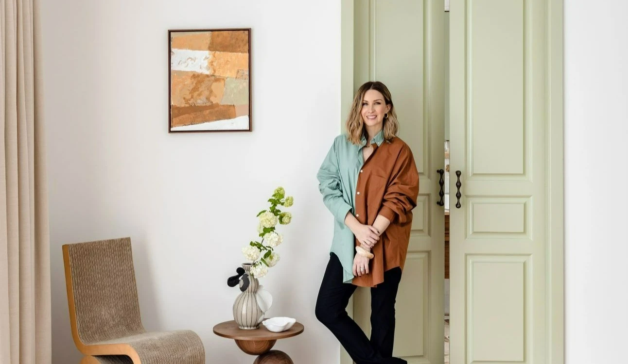
Find out more about the Dulux Colour Forecast 2023 seasonal trends and discover tips for using the autumn palette in your home, with an in-depth Q and A featuring interior stylist Kerrie-Ann Jones. Dulux colours featured: Whisper White and Wasabi. Photographer: Hannah Blackmore.
Can you tell us about the space you have made over? Why did you choose this palette?
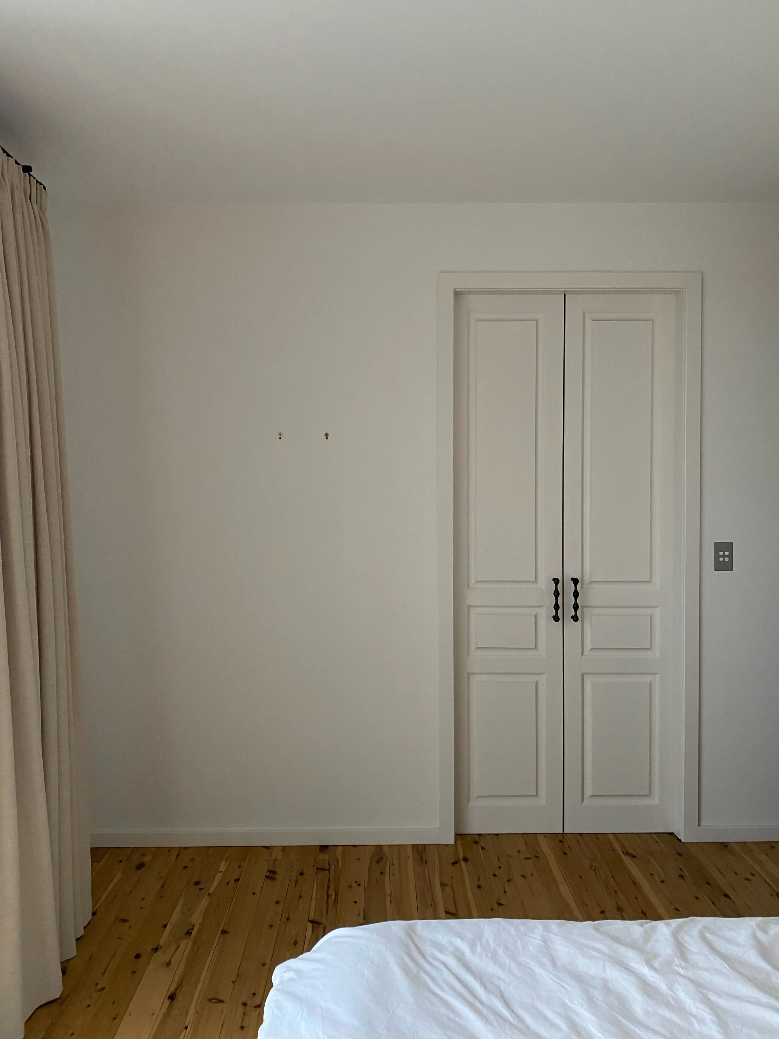
The room I have made over is our master bedroom. Originally, it was very white-based with all the styling. I felt it was time to give it a lift and inject some colour but with my signature warm neutral palette.
The Connect palette is very much my vibe, using warm neutral tones. I used a similar palette with the material finishes throughout my home, so I felt it fit perfectly to use in the bedroom.
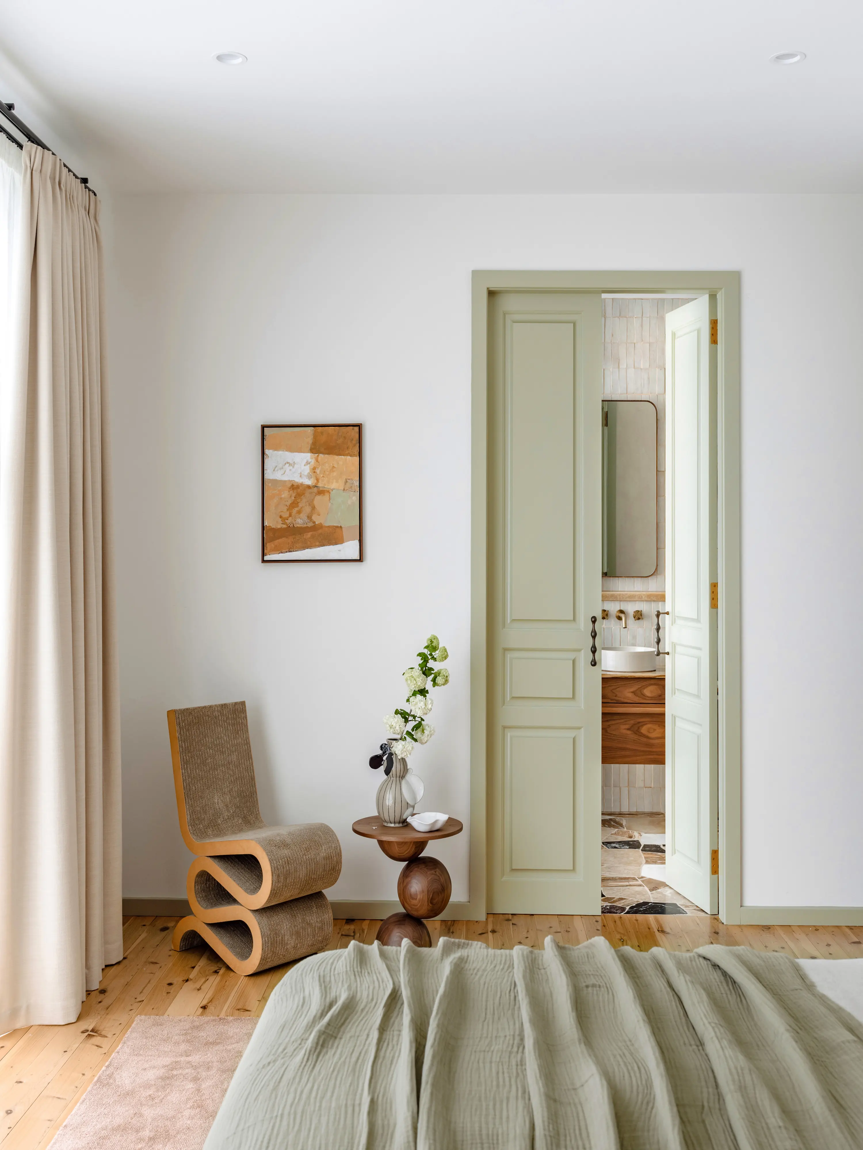
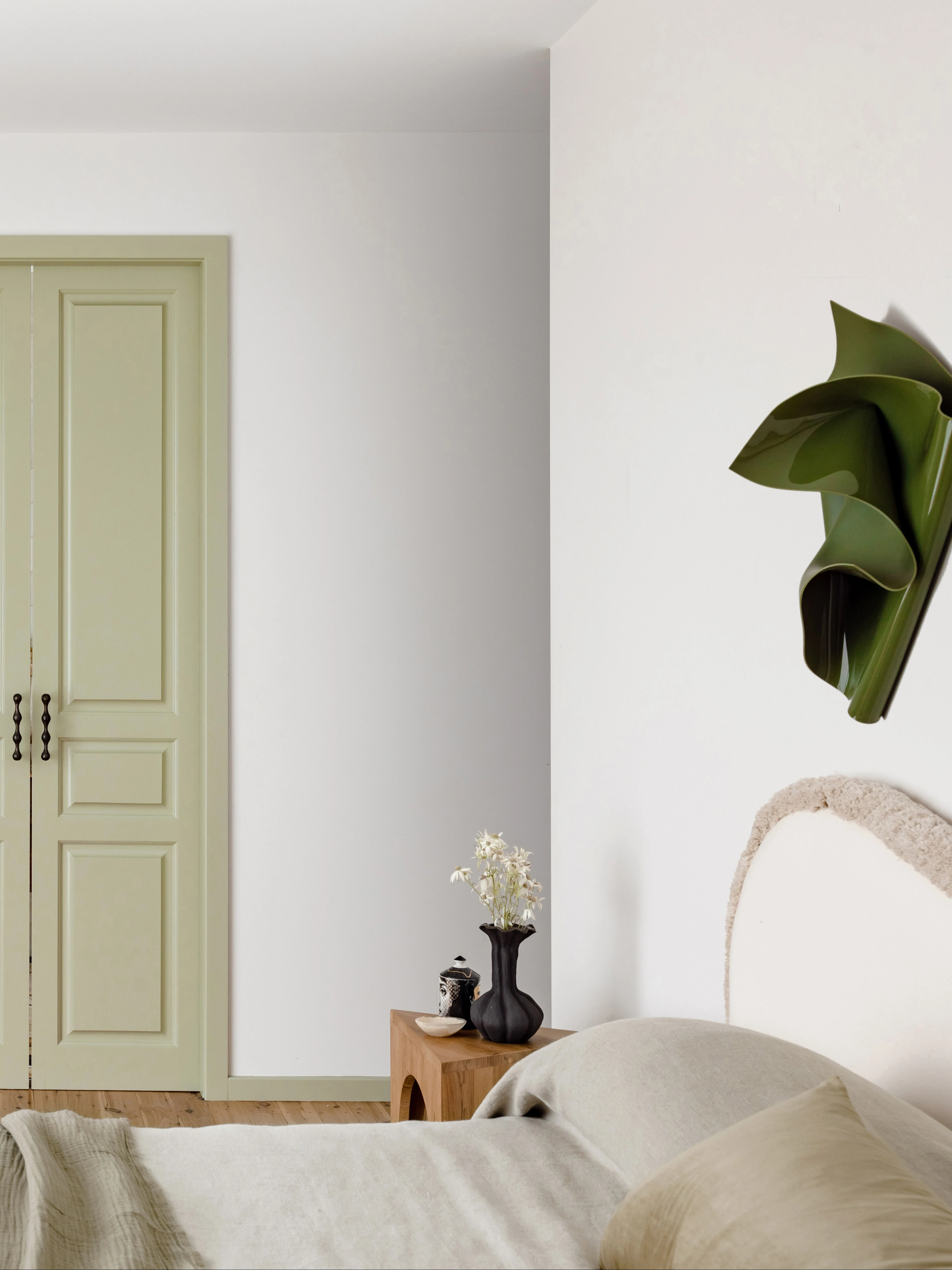
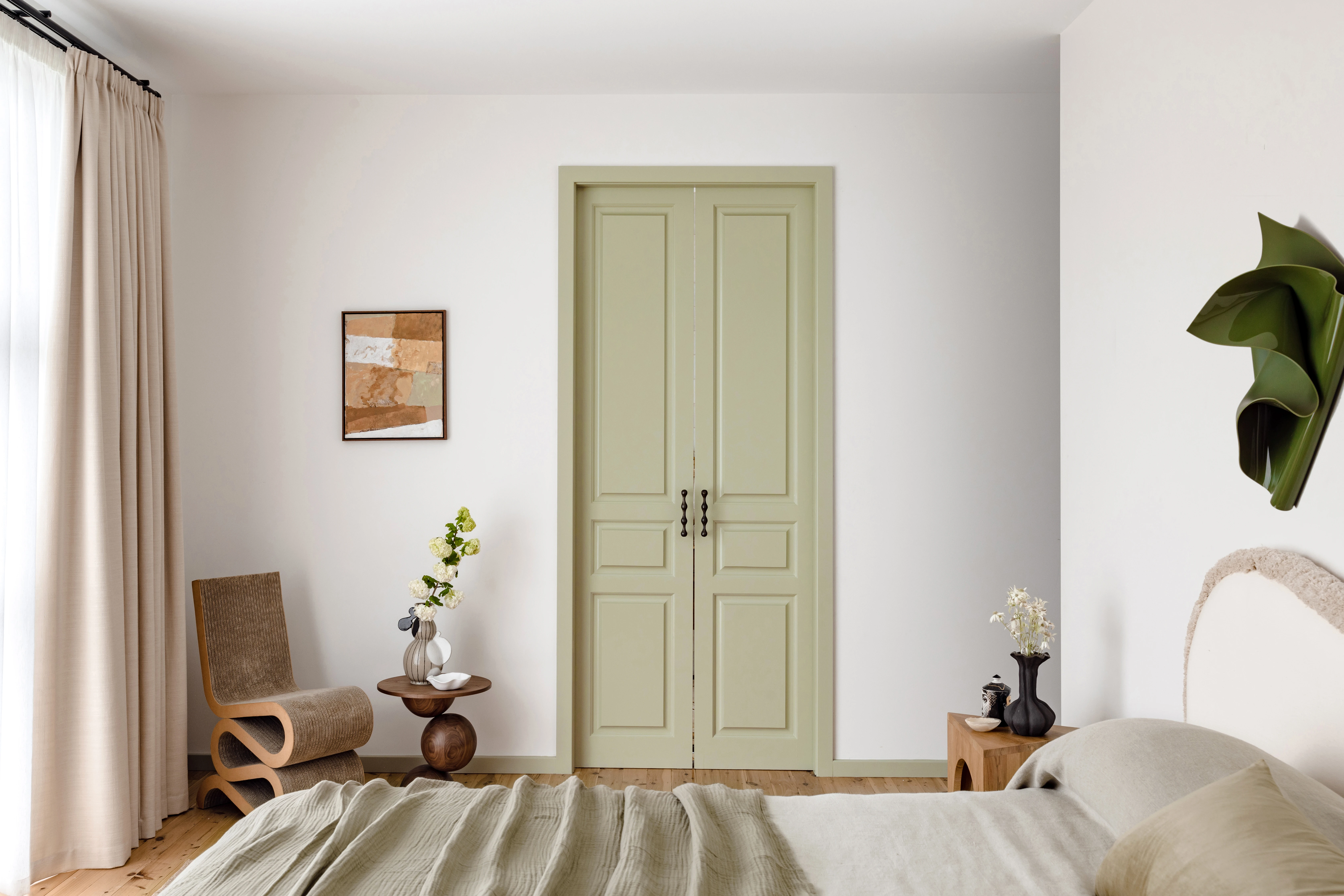
I also used shades of sage green tones to highlight features in my house, so I felt the soft green tone of Wasabi was perfect for highlighting the doors and skirting of our bedroom.
Why did you choose the Connect palette? What mood has it evoked?
The Connect palette has warm earthy neutral tones that integrate seamlessly when used together. You can mix and match any of the colours, and they sit beautifully together. The palette is timeless and sophisticated. I see it still being on trend in years to come. The bedroom now has far more warmth and depth. Previously I played it safe, only using white, but now it feels far more elevated with the skirting boards in the room and French doors into our ensuite painted in Wasabi Aquanamel. The room feels cosier, homely and fresh.
Explore the Connect paletteWhat other components have you used in this transformation?
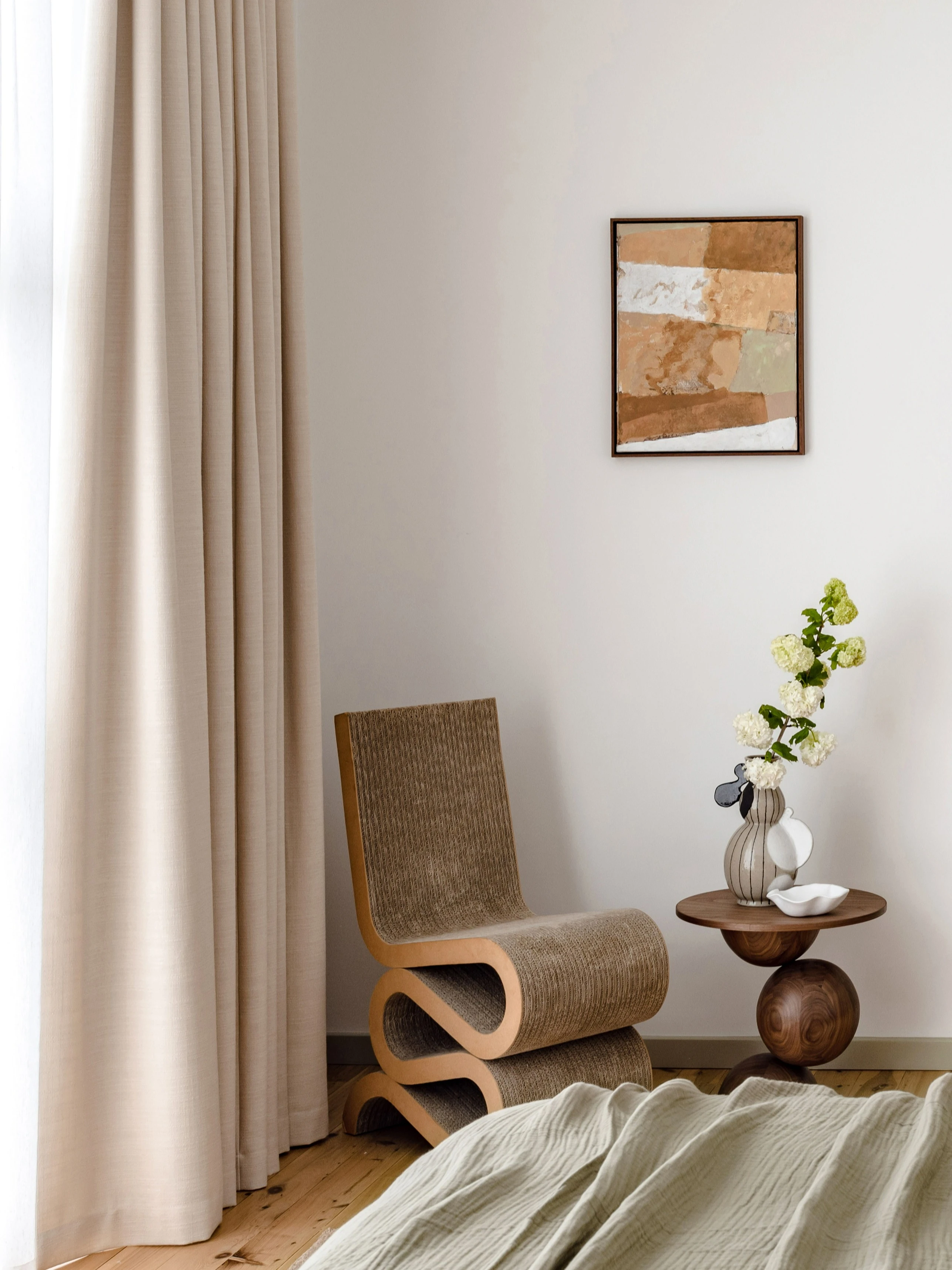
I decorated the room with sculptural furniture pieces such as the Vitra Wiggle chair by Frank Gehry and the Sphere Side Table by Hegi Design House. My bedside table is from Tim Neeve Design. I think using interesting shapes and layers works hand in hand with the colour palette.
I've also layered with a beautiful artwork by Ash Leslie that is painted within the Connect palette and a beautiful wall sculpture by Tan Alridge. Even small details like the ceramics by Marloe Marloe and Elena Strohfeldt both incorporate unique shapes and textures. The bed is layered with white valance, a natural-coloured bedcover by InBed and a beautiful long cushion and throw from Saarde. Layering with a variety of textures adds interest and depth to the space.
Wall
Whisper White
Whisper White lets you create a welcoming atmosphere in your home. As the most perfect ivory, it is a lush, warm white that works beautifully with most colour schemes inside and out in any style of home.

What are your tips for homeowners using the Connect palette?
My top tip for creating a space with the Connect palette is to use the palette as your guide when choosing pieces for the room. If furniture, homewares, or art doesn't fit within the palette, it will look off and stick out in the wrong way. Make sure whatever you include in the room sits within the warm earthy tones. Also, make sure to have lots of layers for the bed and interesting shapes for the furniture and homewares.
What are some key considerations when selecting colours and decor?
The main thing to consider is balancing the colours using the spectrum from light to dark. Sometimes we can be drawn to only the lighter or darker scale, and then a space doesn't feel balanced. It can feel either too light or too heavy.
For my bedroom, I used Whisper White on the walls and Wasabi for the French doors, which are on the lighter scale of the Connect palette. I've then balanced and added depths with the furniture and decor by using dark walnut timber for the side table and a mid-tone brown for the Wiggle chair, rug and art.
Do you think adding colour to doors and trims is overlooked?
I do feel that people often think they need to paint the walls a colour to create an impact for a room, when often it can be just adding colour to the doors and trims that have to make the necessary change. It also allows you to introduce more colour with the styling pieces. Colour can change the look, feel and mood of a space. It adds character and is a way of communicating your style and personality.
Wall
Whisper White
Whisper White lets you create a welcoming atmosphere in your home. As the most perfect ivory, it is a lush, warm white that works beautifully with most colour schemes inside and out in any style of home.

Kerrie-Ann's tips for adding colour:
Start with creating a mood board. I consider it a style guide, and it's always good to refer back to if you are stuck with any colour or design choices.
Don't be afraid of colour. You don't need to use bright hues, you can introduce muted tones of colour into your home.
Experiment with something easy, like painting your front door. It's a small change, but a fun way to inject colour into our home.
Explore more Connect palette inspiration
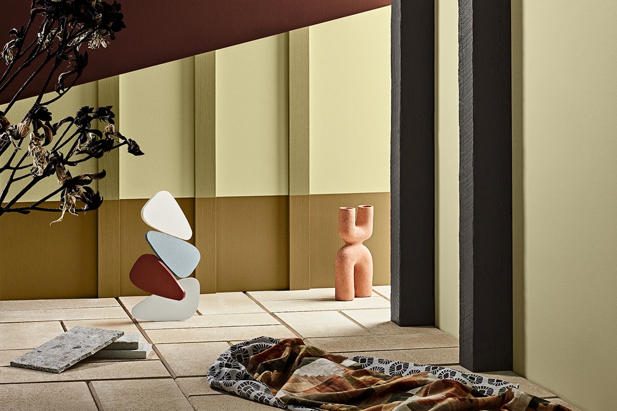
The Connect palette reflects a simpler lifestyle with warm earth-based colours that reinforce a connection with nature.
Choosing colour can be one of the toughest, but most important, steps in a painting project. Our sample pots can help you choose the colour scheme in your home with confidence.
Find out more about the earth-based neutrals of the Connect palette.
Explore more than 4,800 colours including an extensive range of exciting new colours.
Ask an expert. Use LiveChat to speak to one of our consultants for help about colour, products, projects and more.
Get in touch with our local Help and Advice team, available to assist with colour, product and service questions.
Disclaimer
Colours displayed should be used as a guide for your colour selection. To ensure best accuracy, test your colour choice at home by ordering Dulux sample pots, stickers and A4 colour swatches.

