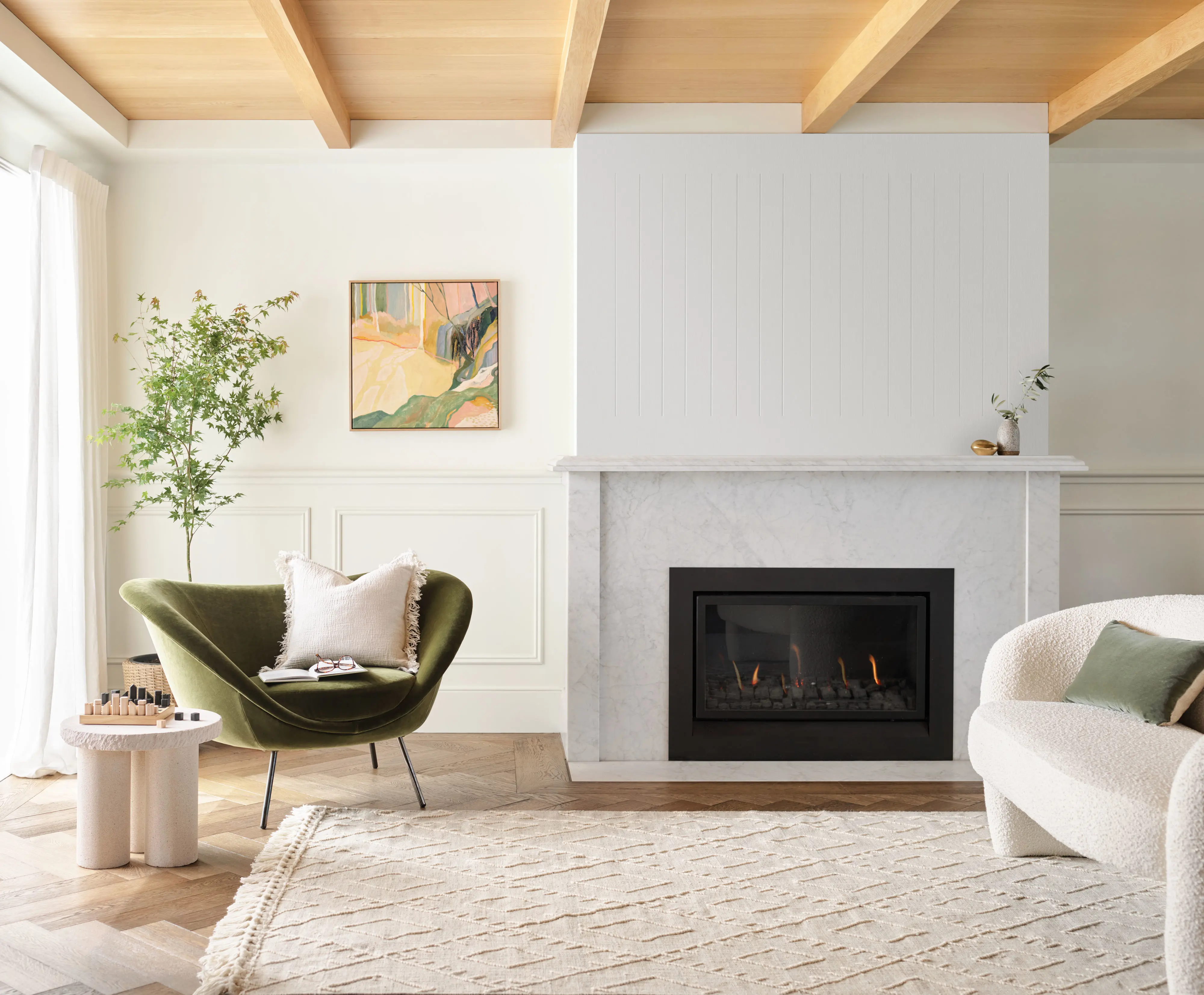
Most loved Interior colours
Australia’s most loved colour choices can easily transform any space; from clean and crisp to warm and inviting.


Vivid White™
White on White™
Lexicon® Quarter
Casper White Quarter
Highgate
Terrace White
Natural White™
Snowy Mountains Half
White Polar Quarter
Antique White U.S.A.®
Berkshire White
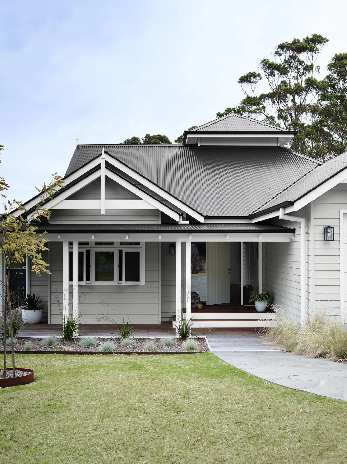
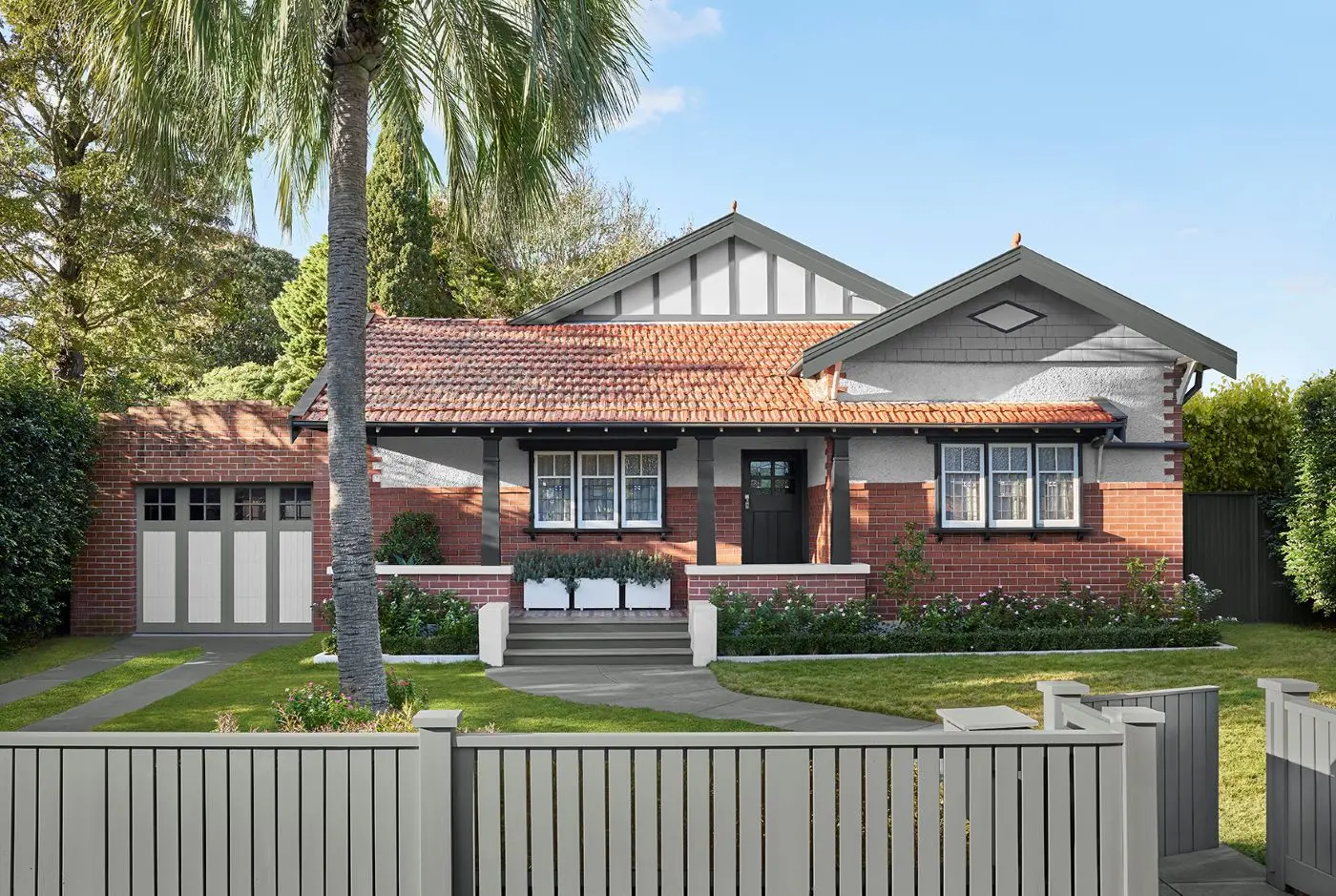
Most popular exterior colours
Discover the most popular exterior colours used for Australian homes, so you can be confident in making the right colour choice.
Colour
Product


Visualise this colour
Colour
Visualise this colour
Colour
Product

Visualise this colour
Colorbond® Monument®
Colorbond® Woodland Grey®
Colorbond® Surfmist®
Colorbond® Classic Cream™
Colorbond® Night Sky®
Colorbond® Ironstone®
Natural White™
Lexicon® Quarter
Colorbond® Shale Grey™
Vivid White™
Tranquil Retreat
Domino
Lexicon® Half
Colorbond® Dune®
Colorbond® Basalt®
Roofing accents and pillar
Exterior walls
Door and window trims
Modern traditional with Colorbond® Monument®
Strike the perfect balance between modern and traditional with Colorbond® Monument®. A good choice for those who want to maintain timeless charm while incorporating contemporary elements within their homes. This deep, rich charcoal is highly versatile and pairs well with Dulux favourites Lexicon® Quarter and Black Caviar.
Introducing the 2026 Dulux Colour Forecast
Dulux Colour Forecast is an evolution and reflection of our world in a moment of time. This year our three curated palettes showcase a universal yearning for wellness, stability and reconnection. These palettes empower you to personalise your space in a way that truly reflects your own unique style.

Meet our design partners
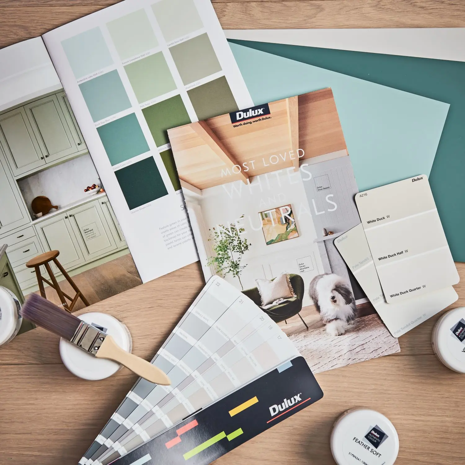
Deciding on the right colour can be difficult. To help you take on your next painting project, try Dulux colour in your home with sample pots, stickers and A4 colour swatches.

Our expert support team can help with everything from choosing colour, what product is the most appropriate for your job or troubleshooting when something hasn’t gone your way.

Disclaimer
Colours displayed should be used as a guide for your colour selection. To ensure best accuracy, test your colour choice at home by ordering Dulux sample pots, stickers and A4 colour swatches.
